
Why we show the rough version
Feel Good Pet did not start with one finished logo. Three real identity routes, shared while they could still change, are how the brand found its mark.
There is a certain kind of creative presentation where everything stays hidden until the big reveal. The mockups are flawless, the story is rehearsed, and the work arrives looking too finished to question.
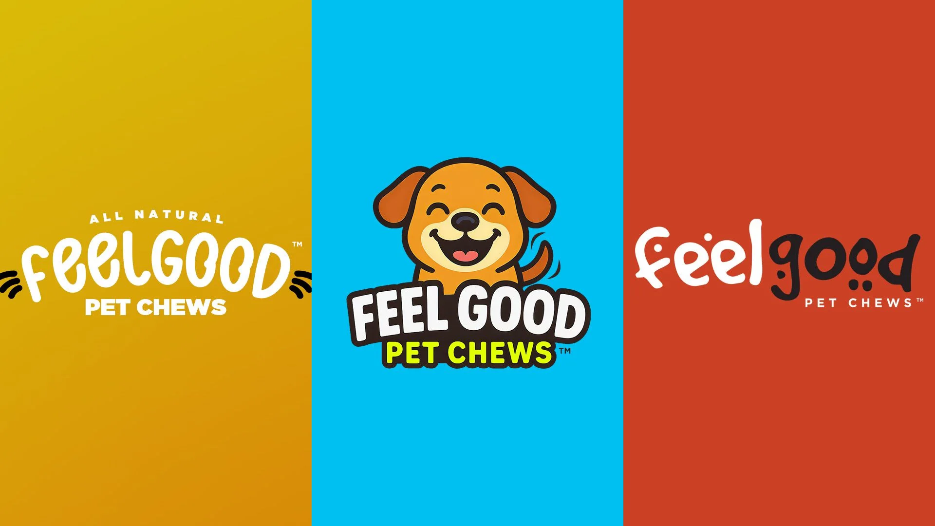
When we started identity work with Feel Good Pet, we did the opposite. We put three complete directions on the table while the mark could still change: Whiskers & Whimsy, The Happy Pup, and Primal Premium.
A finished presentation can be impressive. It is also a terrible time to discover that the idea underneath all that polish is wrong.
Three routes, not one reveal
We like to show the bones of an idea before we spend weeks making every surface perfect. For Feel Good, that meant three identity systems with enough finish to judge on a pouch, not enough to pretend they were final.
Each route had a point of view. We were not dropping a pile of half-formed marks into a meeting and asking the client to find the answer for us. A useful rough version shows the idea, names what is still unresolved, and gives everyone a shared object to react to.
01 Whiskers & Whimsy 02 The Happy Pup 03 Primal Premium
Whiskers & Whimsy
The first route was joyful and retail-friendly. Mustard yellow, a rounded feelgood wordmark, whisker marks, and a dog-and-cat world with plants, hearts, and a bone-shaped window on pack. It said all-natural without going rustic. It was warm, a little cartoony, and easy to like on a pet aisle.
The risk was obvious in the room. If the characters did too much work, the brand would feel like a children's snack instead of a wellness chew.
The Happy Pup
The second route went louder. Bright cyan and yellow, a smiling puppy mascot, condensed type, and color-coded SKUs. Calming CBD, daily support, and the rest of the line could be spotted from a few feet away. It was built for shelf speed.
It also locked the brand to one cartoon dog. Feel Good makes chews for dogs and cats. A single mascot as the logo made that harder than it needed to be.
What the conversation changed
Clients know things about their business that no brief fully captures. Sharing early gave Feel Good room to react while the work was still cheap to move.
They needed friendly without becoming a cartoon. Natural without looking homemade. Distinct on a shelf of beige wellness bags, and still able to live as a simple lockup on a site, a label, and a social avatar.
That is the value of a useful rough version. The fidelity is lower. The thinking is not. You can see why choices exist, where the tradeoffs are, and how one decision affects the next.
01 Color-coded pouches 02 Mascot-led pack 03 Elevated pouch
The mark that survived
The lockup that stuck took the structure from the first route and the handmade character from the third. All Natural still arches over the wordmark. Whiskers still sit on either side. Pet Chews still holds the base. The lettering itself got more organic, closer to the primal route's feel, without splitting the name into two competing colors.
The mascot stopped being the logo. The characters could still show up on pack as supporting illustration. The color system stayed benefit-led so SKUs could differ without the brand falling apart.
Once that direction was carrying its weight, we refined it hard: spacing, the lockup at small sizes, pouch hierarchy, and the construction of the mark. The rough version is part of how the brand was made, not a discarded first draft.
Refined lockup
Then we earn the polish
The final work feels more resolved because the finish is supporting a direction everyone believes in. The reveal may be quieter, but the result is stronger. We will take that trade every time.